Remember my M&M's packaging plate? Well it was just the first step. I had it printed on a glossy paper and assembled it to make it look like a real product and fortunately, my professor loved it and gave me a perfect grade (though I forgot to take a picture and it's ruined now :()
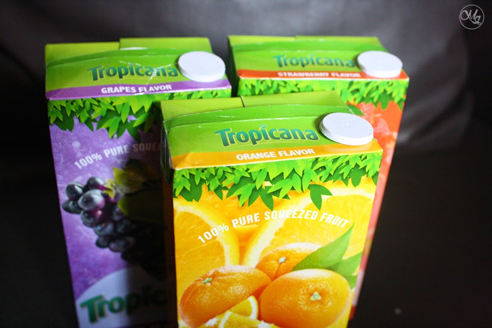
For the next plate, we're asked to make a tetra pak design for any fruit juice. I chose Tropicana!
And a mock up version:
Does it look appealing and real to you? Hahaha (Credits to the owners of the fruits (photos) I used.)
PS. I made a new logo for myself!


I looks real pro! A definite yes for me. You are doing a great job!
ReplyDeleteThank you! That means a lot <3
DeleteMost of all I love orange!
ReplyDeleteYay! :)
DeleteYou put this together? Wow that's awesome, it definitely looks professional!
ReplyDeleteYes I did! Thank you so much Jane! :)
DeletePretty awesome package design c: Good job!
ReplyDeleteIt's really appealing ^_^ Xx http://icepandora.blogspot.com
Yay thank you!!! :)
DeleteThat is just incredible!! I can't believe you made that. I miss Tropicana (it isn't sold here in Australia)
ReplyDeletehttp://dignifiable.blogspot.com
Aww thank you so much Natalie!
Delete